In the beginning of this unit, I was quite nerved up and tensed as I had no knowledge about certain programs that we were introduced to and some programs that I knew I was not so confident about as photoshop and illustrator are not my forte. With the experiments that were handed out in task 1, I could gain more confidence in these programs even InDesign I was able to get the hang of. Compared to what I could do in the beginning to the present, I can admit that I learned a lot of new techniques and features which helped me come up with projects I never thought I’d be able to accomplish such as manipulating a photo to something completely different and also a newspaper layout.
Blog
Task 3: Everybody Loves The Sunshine
My Showreel which covers and displays some of my believed to be best works throughout Semester 1.
Task 2: A boring header won’t do

For this task, we were encouraged to edit some images in a way which could become potential headliners in a newspaper. The images I used were all taken in Valletta sometime ago which I shot with using my Nikon D5300.


The Theme I went with was somewhat post-apocalyptic since it involves a theme of abandonment from god in the second picture, a monster showing up moments before the kid in the picture realises and the sea turning blood red.
The Headline titles were all created with the font “Castellar” as I wanted the titles to have a traditional look and stand out from the rest of the text which used the “minion pro” font.
For my Logo, I wanted to go with something simple but something that represents a person reading a newspaper. With knowledge gained this year I was able to create a pair of spectacles with squiggly lines which represents the reflection of the text that is being read.
![]()
As far as layouts are concerned, I tried to find two layout inspirations off the internet but I ended up creating the final layout from scratch as I went along.


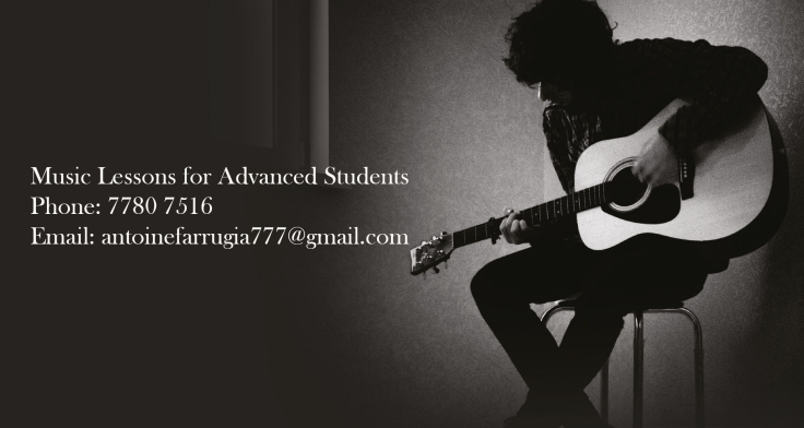
For the advert that I put in my newspaper, I found an image online and added some basic information one would find for a music teacher ad
References
The Odyssey Online. (2016). What Music Can Teach Us About Life. [online] Available at: https://www.theodysseyonline.com/music-teach-life [Accessed 15 Jan. 2018].
Pinterest. (2018). Holiday Letters: Creating Unique, Fun Family Updates. [online] Available at: https://www.pinterest.co.uk/pin/542543086330238415/?lp=true [Accessed 12 Jan. 2018].
Amber-Mariee (2012). Front cover newspaper layout for Final Design:. [online] Slideshare.net. Available at: https://www.slideshare.net/Amber-Mariee/front-cover-newspaper-layout-for-final-design [Accessed 12 Jan. 2018].
Newspaper PDF file
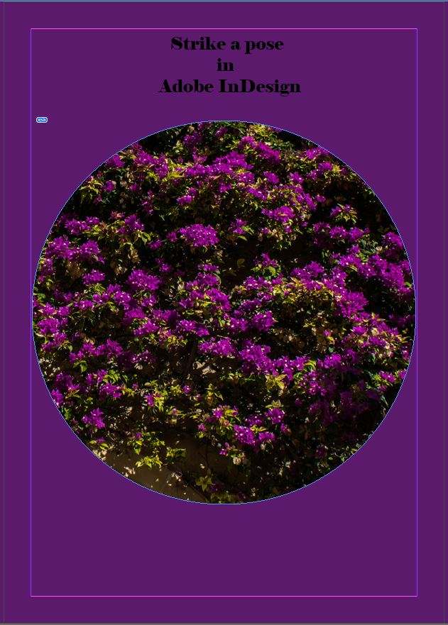
Task 1: Strike a pose: InDesign

Adobe InDesign
![]()
Such as the other program by Adobe Illustrator, InDesign is a vector-based program which has the ability to withstand multiple pages and also to create master pages. InDesign is mainly used to create magazine or book layouts which have consistent templates and numbering on every page which are linked to the editable master page.In InDesign, one can collect all his or her work from Illustrator and Photoshop to create multiple layouts for pages.
Placing and Formatting Images
The youtube channel “Good Creative Academy” is a youtube channel dedicated to teaching such software like Photoshop, InDesign and Illustrator. The channel is run by Chad Neuman who has a Bachelors degree in Communication, a Masters degree in journalism and Media studies and a Ph.D in Communication. He has also worked as a managing editor for two graphic design magazines, a webmaster at a newspaper, a director for internet development and he is currently an assistant professor of graphic design and journalism in a local university.
I chose the tutorial he has about how to place and format images on the software Adobe InDesign which will help me further on when it comes to creating a magazine layout.
Step 1: Upon opening the application, we open a new document and set the page list to any desired number we want or how many we need. We then need to place a new image in the document to get started on creating our magazine.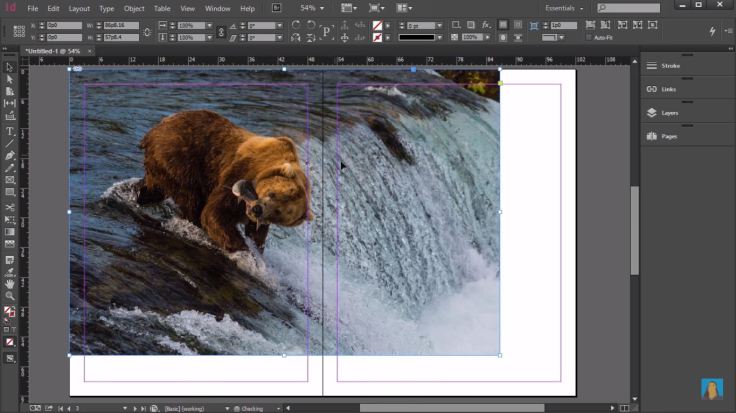
Step 2: Normally when we want to place a photo we go to file, place click on our desired photo and hit open which will just put in the photo randomly in the document. However, we can place a photo in any location we want it to. This can be done by drawing a rectangle where you want the photo to be, go to file place, choose another photo and make sure that “Replace Selected item is ticked”


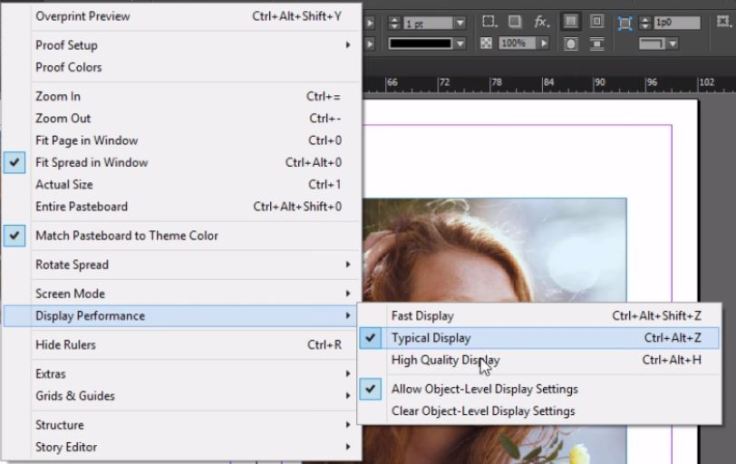
Step 3: Once a photo is imported into our document it can lose its quality and an easy way to fix that is by going to view, display performance and high-quality performance or use the shortcut CTRL+ALT+H.
Step 4: Photos can not only be imported into rectangles but different shapes as well depending on which tool you use.
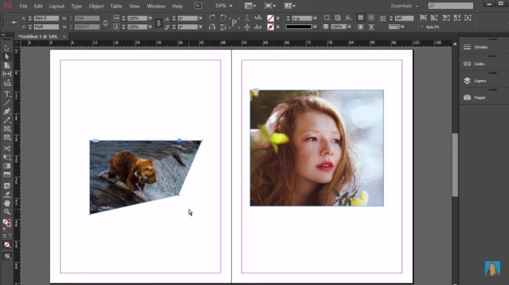
Step 5: With a photo imported into our document we are capable of giving it a new shape within InDesign. This is possible by using the direct selection tool. All this does is move the point rather than resizing or crop like what we do with the regular selection tool
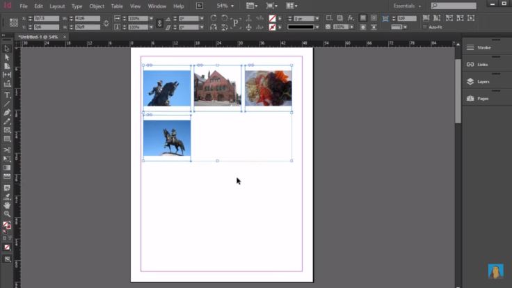
Step 6: We are also capable of inserting more than one photo at the same time by going to file, place and choose the photos that you want to put in your document. Once the photos are chosen, hold CTRL+SHIFT and click and drag which will create a grid to show you how the photos are gonna be placed.
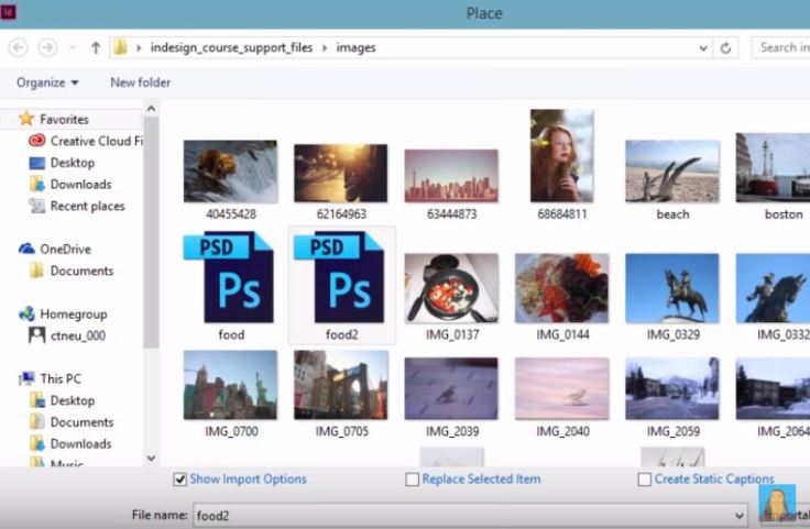
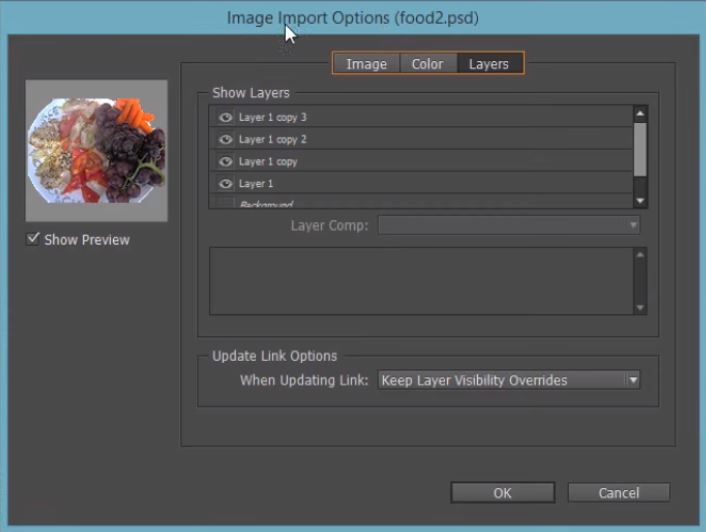
Step 7: We can also import PSD files rather than JPEG files only. When placing a PSD file in our document, it shows us options where we can select the layer we want in our document. This can be done by before placing the file you hit the show import options.
Self-Initiated Experiment
Considering I’ve never used this program before, I decided to go for something basic so I can grasp the concepts of placing and formatting images. I followed this tutorial but obviously using different images and layouts. I also attempted different things which are not in the tutorial so I tried to create a magazine layout. As a stepping stone to learning this new program I’m pleased with the personal progress I’ve made and I’m not as uncomfortable as I was with the program now.
References
-
Creative Studio. (2014). What is the difference between Adobe InDesign and Adobe Illustrator?. [online] Available at: http://www.creativestudiosderby.co.uk/whats-difference-indesign-illustrator/ [Accessed 23 Nov. 2017].
-
Msnod.com. (2017). Adobe Certified InDesign CC Training, Atlanta, GA – Web Based InDesign Training, Live Classroom Training, InDesign Training – ADOBE Creative Cloud. [online] Available at: http://www.msnod.com/pages/indesign.html [Accessed 23 Nov. 2017].
-
YouTube. (2017). Placing and Formatting Images in InDesign Tutorial. [online] Available at: https://www.youtube.com/watch?v=-YL2QSai9Ng&t=6s&list=LLJND6LfBaDskNuxyiZ4zVcw&index=2 [Accessed 24 Nov. 2017].
-
YouTube. (2017). Good Creative Academy. [online] Available at: https://www.youtube.com/user/goodcreativetutorial/about?disable_polymer=1 [Accessed 24 Nov. 2017].
Task 1: Strike a pose: Adobe Illustrator


Adobe Illustrator is a professional graphic art application used to create print to web graphics and posters. Adobe Illustrator is also a vector drawing program which is quite challenging and does require some work before one can truly reach his full potential in the software while knowing its’ ins’ and outs’. Despite it being a challenging program, it is quite easy to learn the basics and create professional standard work.
Advantages of Vector Graphics
- High-resolution printing
- Smaller file size
- Lines are crisp and sharp in any sizes
- No resolution loss when using different scales
- Good Drawing for illustrations
Disadvantages of Vector Graphics
- Drawings tend to look flat and cartoon-like
- Difficult to produce photorealistic drawings
Uses for Adobe Illustrator
- Logo Design
![]()
- Drawing maps
- Illustrations

- Infographics
- Photorealistic drawings
- Packaging Design
Geometric Line Art
The youtube channel that I decided to follow for this experiment is “Ste Bradbury Design”. Stephen Bradbury is a Graphic Design graduate from the UK located in Manchester. His channel consists of tutorials and speed arts which help educate and teach people on how to do certain things which they did not know how to do before.
The tutorial that I decided to follow is how to create art using geometric lines by using the software Illustrator by Adobe.
Step 1: Select a shape of your choice such as the rectangle tool to create a square. By holding the shift key and clicking the left mouse button, drag the mouse to create your square or shape depending which tool you went for.
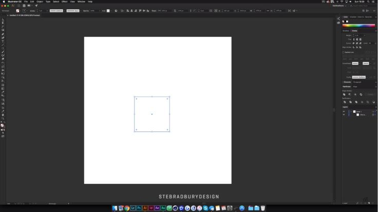
Step 2: With the square selected we then go up to Effect, select Distort & Transform and then hit Transform. Once you select transform, adjust the angle to around 5% if you don’t want the borders to overlap each other, adjust the number of copies to your liking and set the scale of the horizontal and vertical to your preference.


Step 3: Next step copy the shape that you have just created and with that duplicate by clicking CTRL C and CTRL V if you are on a PC or if you are on a Mac hit CMND C and CMND F and rotate it at around 45% to create a different effect to your shape.
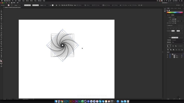
Step 4: To finish off the project and make it more appealing, is adding some colour. Make sure that stroke is selected and hit gradient. Next is to change the black and white colours with colours of your choice and also change the background to a colour of your choice which complements your shape.


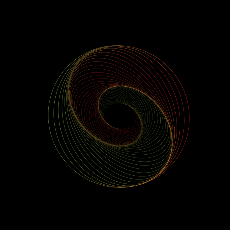
Self-Initiated Experiment
For my self-initiated experiment, I decided to follow this tutorial but vary in shapes, colours and sizes. I thought that the process would be more complicated to create such a stunning effect but in hindsight, it is really simple. Thanks to this case study I feel slightly more confident using this software and I am keen on learning different things to create
References
Whitman.edu. (2017). Adobe Illustrator – Introduction. [online] Available at: https://www.whitman.edu/geology/Illustrator%20Web/intro.htm [Accessed 7 Nov. 2017].
Vector Diary. (2008). Day 1: What is Illustrator? | – Illustrator Tutorials & Tips. [online] Available at: http://www.vectordiary.com/illustrator/what-is-illustrator/ [Accessed 7 Nov. 2017].
YouTube. (2017). Ste Bradbury Design. [online] Available at: https://www.youtube.com/user/FallenDesignsUK/about?disable_polymer=1 [Accessed 9 Nov. 2017].
YouTube. (2017). Geometric Line Art Tutorial | Adobe Illustrator. [online] Available at: https://www.youtube.com/watch?v=kCwmEfCsPdw [Accessed 9 Nov. 2017].
Task 1: Strike a pose: Photoshop

Photoshop

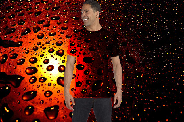
Photoshop by Adobe is a very popular and powerful software by Adobe. This software is used by professional photographers and also designers. Photoshop is mainly used to manipulate and edit photographs.
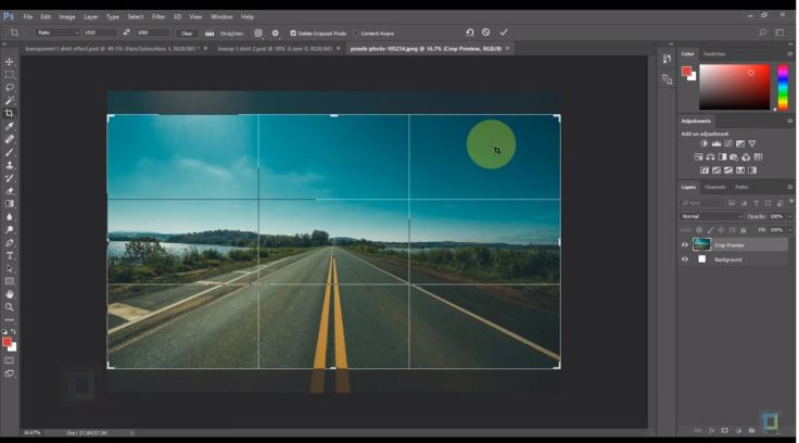
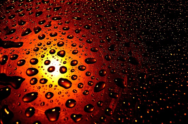
Camouflage photo effect
The youtube channel “
Step 1: Once opening the application, go over to file and find the background photo that you are going to use. By using the crop tool, crop the image so it will have a cinematic crop look with the ratio being 16:9.
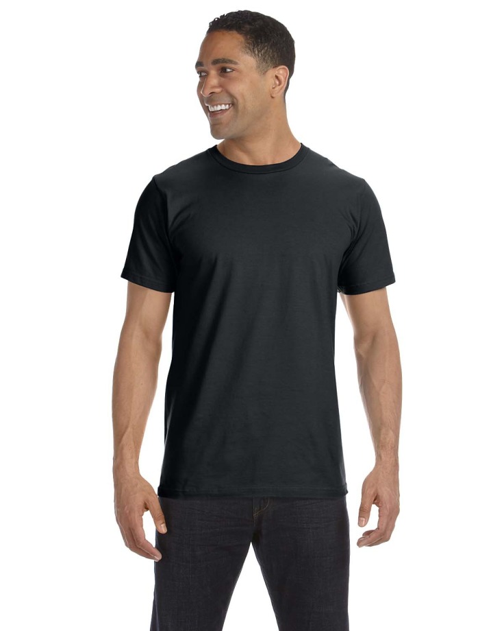
Step 2: Reopen File and click on Place Link and select the foreground, in this case, being the person wearing the plain T-shirt. While pressing the Alt and Shift key to either diminish the photo or enlarge it.
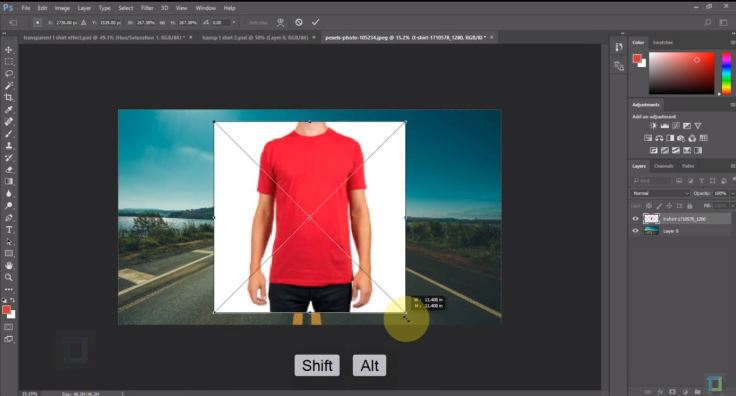
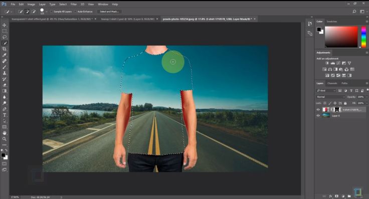
Step 3: The white background on the foreground photo and it needs to be removed. To remove it you select the magic wand tool and set the Tolerance to how much you feel is needed. Once selected click over the white areas to remove them. After that is complete click on the layer mask of the foreground and click CTRL + I.
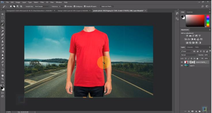
Step 4: Next you use the quick selection tool to select the T-shirt and reactivate the layer mask and press ALT and Backspace which will hide the colour of the T-Shirt.
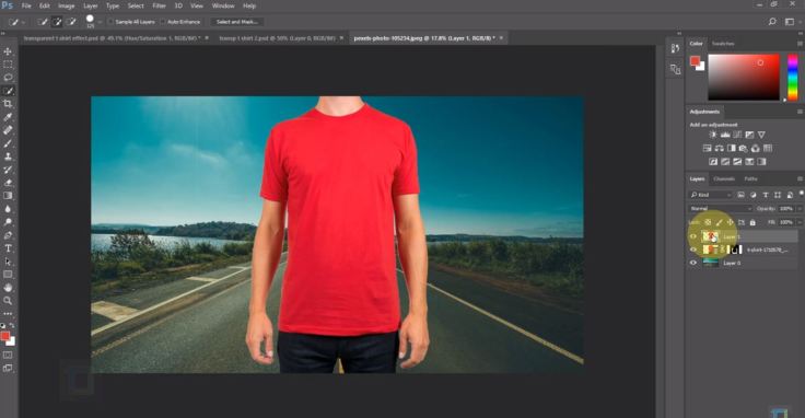
Step 5: To make the T-shirt reappear but in a layer of its own. go in the model layer and press CTRL and J. This will separate the model and the T-shirt in a layer of their own.
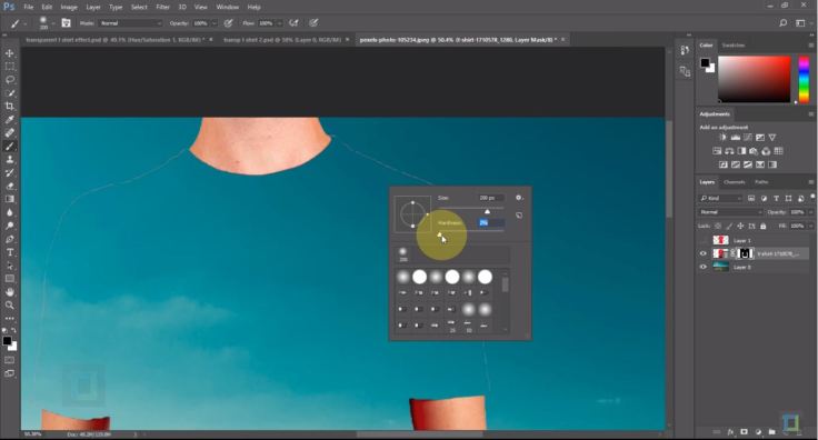
Step 6: To erase the tan lines from the model layer, click on the brush tool, make sure that the colour is black and set the hardness to 100%. This has to be done on the layer mask.
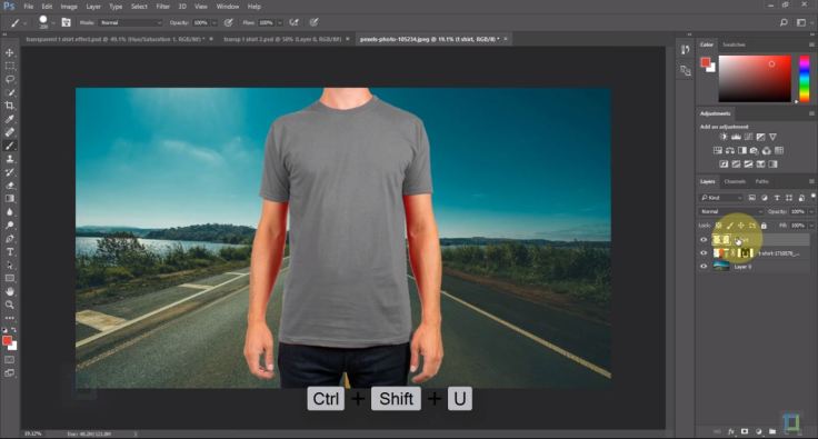
Step 7: Next step is to change the colour of the T-shirt on the T-shirt layer to black and white by pressing CTRL + SHIFT + U.
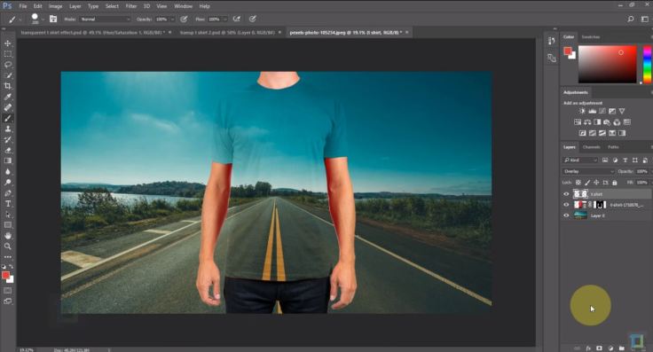
 Step 8: Next step is to change the “normal” mode in the layers panel to Overlay.
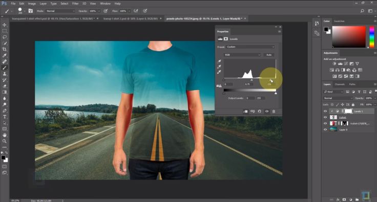
 Step 9: The effect is done but to enhance it even further and make it more believable the next steps will bring us to a better result. Next, we create a new adjustment layer and select levels. Turn on, Clipping mask, and start messing around with the dials as you seem fit.
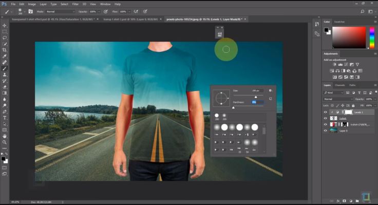
 Step 10: Make sure that layer mask is active, colour is set at black, right click and change the hardness to zero 0% and make the brush a bit bigger just to lighten up the bottom.
 Step 11: For the final step, a displacement map is needed. T-shirt layer has to be active and duplicate your layer in a new document in the destination section. In the new document add the gaussian blur effect to the T-shirt. Save the document and apply it to the original document. The displacement map needs to be placed on the background layer so it has to be active. Right-click that layer and convert it to a smart object. Next, you go to the filter tab, go to distort and select displace, locate the displacement map and open it. If the displacement map got placed on the entire image and not the shirt, to fix that you need to select the smart filter and hit CTRL+I. Hold CTRL again and hit the T-shirt layer while the layer mask is active and press ALT+Backspace.


Self-initiated Experiment
For my self-initiated experiment, I decided to try this effect out myself using different images. To be honest, I’m kind of impressed with the outcome as photoshop is not my forte so to speak but for a first try on this effect, I am pleased with the outcome.
References
YouTube. (2017). Transparent Clothes Effect | Photoshop Tutorial. [online] Available at: https://www.youtube.com/watch?v=EvazECoMvrM&t=490s&index=2&list=LLJND6LfBaDskNuxyiZ4zVcw [Accessed 26 Oct. 2017].
Nyfifth.com. (2017). Blank Shirts Tear Away Tags Sale – from $2.27. [online] Available at: http://www.nyfifth.com/blank-shirts-tear-away-tags-sale-qid-16293.html [Accessed 6 Nov. 2017].
Pixabay.com. (2017). Free Image on Pixabay – Drops, Rain, Background, Seasons. [online] Available at: https://pixabay.com/en/drops-rain-background-seasons-22223/ [Accessed 6 Nov. 2017].
Task 1: Strike a pose: Premiere Pro

Premiere Pro
Premiere Pro by Adobe is basically a software used by either amateurs, professionals and enthusiasts to edit videos. Premiere Pro can either be purchased on its own or it can be purchased amongst other Adobe programs such as Adobe Illustrator, After Effects, Photoshop and so on.
The Strengths of Premiere Pro
In Adobe Premiere Pro one can import audio, video and graphics in different formats. Premiere enables the ability to manipulate and edit the elements mentioned previously in a visual timeline. These elements can have effects added to them, such effects include filters, titles, colour grading and so on. Once the timeline is finished, it can be exported in a variety of formats which include DVD, DV and formats for Internet websites such as YouTube, Facebook etc.
The Weaknesses of Premiere Pro
The title creator, even tho can create good titles is not particularly advanced. Premiere’s feature for mixing and editing audio features are good but the program is not recommended for users who want to specialise in sound editing. Even though Premiere Pro has a variety of transitions and special effects that can be added to one’s timeline, professionals in special effects are most likely to purchase different effects and transitions from third party suppliers. Some features aren’t in this software so users would be encouraged to purchase separate products such as Adobe After Effects and Adobe Audition where one of them specialises in effects and the other specialises in audio.
Use Of Premiere Pro in the Industry
For programs who film with multiple cameras, Adobe Premiere Pro is equipped with multicam editing which is useful for those programs who film in multicam.
Clean Cinematic Title Animation
The youtube channel “Ignace Aleya” is an educational youtube channel which helps educate and inspire people who work within the filming industry. This channel revolves around Editing, Filming, Visual Effects, Motion graphics and post-production.
The tutorial that I decided to analyse is about how to create a clean cinematic title animation by using Adobe’s Premiere Pro software.
Step 1: Once a sequence is created, move to the Editing section of premiere, click on the text tool in the preview monitor and write down anything that seems fit to your project.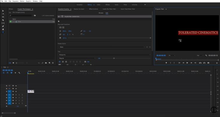
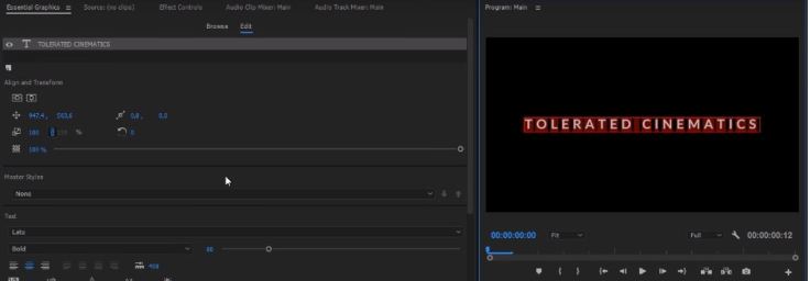
Step 2: To give the title a cinematic look, Give the title a suitable font to the project and change the text to Bold and the last part is change the line spacing to 3oo. Once that is done go to the window tab, select Essential Graphics and align the text to the centre.
Step 3: Now the animation process commences, select the Effects Controls tab and in the timeline drag the sequence to last around 6 seconds. In the beginning of the sequence, change the opacity to 0.0% which will create a keyframe at the beginning of the sequence. On the timeline move to around 2 seconds and 4 seconds and change the opacity to 100%. At the end of the timeline change the opacity back to 0.0%. this will create a fade in and fade out effect. Select all keyframes, right click on the mouse and select Auto Bezier. This will give a soft touch to the animation.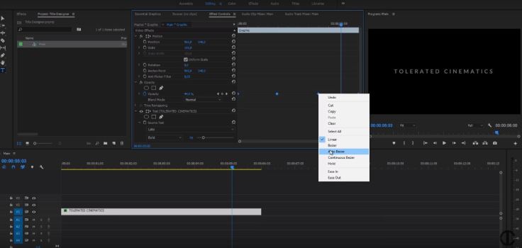
Step 4: Move over to the VIdeo Effects tab and select the Gaussian blur in the Blur & Sharpen drop-down menu to apply to the text. Scroll down in the effects controls tab until you find the gaussian blur effect. At the beginning of the timeline set blurriness at 50%, move to 2 seconds and 4 seconds and set both of them at 0.0% and at the end set the blurriness effect back to 50%. This effect will make the fade in and fade out cleaner.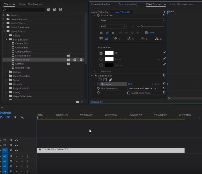
Step 5: To add a more dynamic feel to the title sequence, move over back to the Effects Controls tab and click on the stopwatch for the Scale. Go to the end of the timeline and change the scale to around 110% which will add a zoom in effect to the sequence.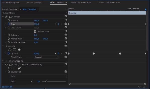
Step 6: Select the Selection tool, hold Alt and drag the title layer on top of the original layer which will create a duplicate. Click on the text of the duplicated layer and change it according to your preference. Reduce the size of the text and change it from Bold text to a Light and move it down from the original text.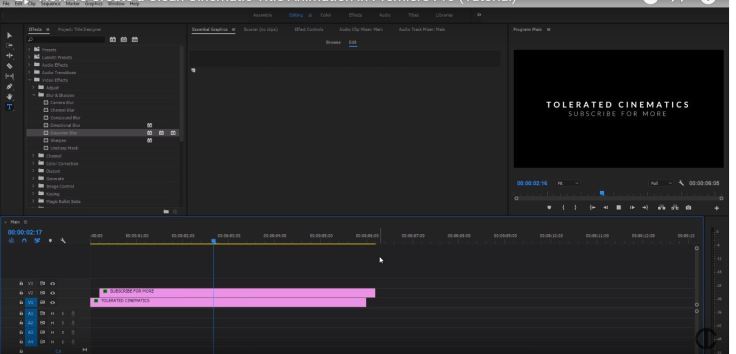
Self-initiated experiment.
With the knowledge gained from the previous steps that I have mentioned, I gave it a go myself using a different font, different wording and also spacing 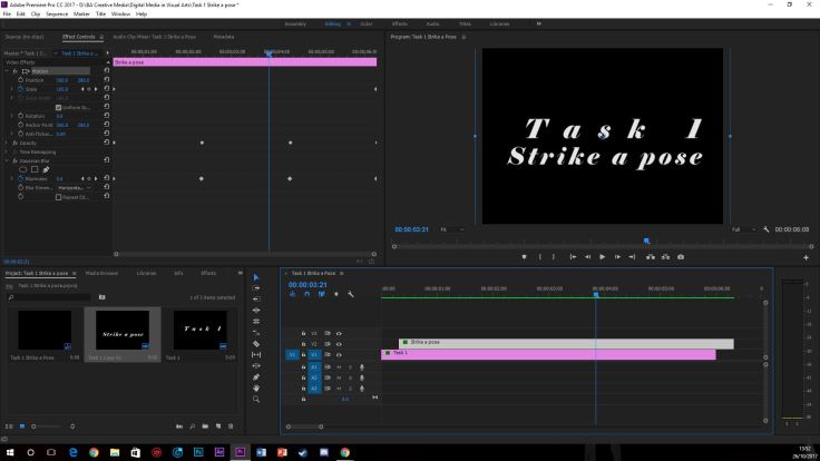
References
Technologypartners.adobe.com. (2017). [online] Available at: https://technologypartners.adobe.com/content/dam/tep_assets/public/public_1/Top_10Reasons_to_use_Adobe_Premiere_Pro.pdf [Accessed 23 Oct. 2017].
Mediacollege.com. (2017). Adobe Premiere Overview. [online] Available at: http://www.mediacollege.com/adobe/premiere/pro/intro.html [Accessed 23 Oct. 2017].
Google.com.mt. (2017). Premiere Pro – Fittex bil-Google. [online] Available at: https://www.google.com.mt/search?q=Premiere+Pro&source=lnms&tbm=isch&sa=X&ved=0ahUKEwic0-fw9InXAhUKAcAKHV63AHYQ_AUICigB&biw=1366&bih=637#imgrc=yjlUagiOpCUz-M: [Accessed 23 Oct. 2017].
YouTube. (2017). How To Create a Clean Cinematic Title Animation in Premiere Pro (Tutorial). [online] Available at: https://www.youtube.com/watch?v=0ZcyLet8h_4 [Accessed 24 Oct. 2017].
